Case Study: WhoZin
Let’s make plans together
A collaborative approach to travel planning
The initial brief was intentionally open-ended: Solve a problem. Imagine problems users might have, conduct interviews to determine their actual needs, identify one insight into that problem—then dive deeper.
Methods and Roles Employed
Primary and Secondary Research, UX Design, UI Design, Prototyping, and Usability Testing
Phase 1:
Research
Three rounds of user interviews were conducted. Two rounds generated a general problem topic. The third round supported a deeper dive into that topic and resolutions for the problem.
User Interviews
Three rounds of one-on-one user interviews were conducted over two weeks. The first-round topic offered was an inquiry into altered perceptions of time during Covid-19. The second-round topic focused on questions related to organizing travel documents. Third-round interviews revolved around the topic of planning trips with a group.
Round 1 Interviews
Many joked during the early pandemic that time had become “meaningless.” Users were asked during 30-minute interviews how their perception of time had changed during lockdown. Asking users to describe how they felt about the concept of time in a pandemic yielded information about new ways they scheduled time, and the diverse streaming content consumed to help pass the time. Subjects outlined daily, often repetitive, routines that included work, exercise, and entertainment habits.
⚠️ While interesting to explore, no significant insights were gained from these interviews and Round 2 required a pivot in strategy.
Round 2 Interviews
Interviewees were asked how they prepare for travel. Specifically, they were asked to describe how they organize the documents needed at different stages of a trip. In the end, they were generally confident that any documents, receipts, or reservation confirmations they needed could be fond with a quick email search. Online booking, they noted, was the most popular way to purchase tickets and make other travel arrangements and so there was always a digital solution to any need for documentation.
⚠️ These interviews revealed a theme: traveling with others can become stressful, especially if you’re responsible for organizing the group’s activities.
Round 3 Interviews
Picking up those themes in the third round of questioning, respondents were asked about their planning process and, in particular, their emotional response to being in the role of trip organizer. Some noted they often became the de facto group travel planner, compiling lists of activities and places to eat for the rest of the group.
Insights
Even when users became the de facto planner, they didn’t necessarily want the burden of the role and its responsibilities.
Users indicated they would prefer input from other travelers ahead of time, hoping to uncover consensus in the group’s needs.
When fellow travelers had contributed to a plan in the past, users acknowledged they had warmer feelings toward them.
Users appreciate flexibility in travel plans, and admitted no plan is ever final. In fact, users said it was important to have multiple back-up activities and restaurants to choose from.
If there was an easy way to organize a trip, users indicated they might try it. Otherwise, most were comfortable sticking with their spreadsheet or calendar entries.
Users were intent on avoiding hurt feelings—theirs and others’—that could lead to unwanted resentment on the vacation.
When plans need to change, it is frustrating trying to engage people in problem-solving, or finding consensus on an alternate plan.
Users find it especially frustrating when they are left to figure out spur-of-the-moment solutions, knowing they cannot please everyone.
Competitive Analysis
A handful of trip planning apps designed to help users organize flights, car rentals, and other travel needs currently exist on the market. Through these apps basic travel plans can be shared with others, but opportunities to collaborate on collective activity-planning are limited—and, when available, are not fun to use.
Click to enlarge
Phase 2:
Define
After the research phase was complete, findings were synthesized into actionable data, and a User Flow was created, laying the groundwork for user testing.
Persona
A single persona was created from the user research to represent the travel-planning user:
Terésa is a software salesperson in her mid-forties, a married mother of two, and an inveterate planner. She can’t stand sitting around on vacation. She wants to be on the move, not wasting time in a hotel lobby tossing around ideas, debating what to do. She’s currently planning a trip with college friends. Her two goals: making sure everyone contributes (in some way) to planning, and mitigating the hurt feelings that come when ideas don’t materialize due to lack of consensus.
Click to enlarge
Empathy Map
The empathy map—a distillation of the goals and needs of users like Terésa—highlights a desire to be a successful host, and to be considered useful. This user enjoys the information-gathering process when planning a trip, trying to identify activities and restaurants that will satisfy everyone’s needs. They’re happiest when each day has a menu of possible activities. Yet, they feel planning efforts can be easily dismissed by those who are disengaged from the process.
Understanding user motivations informs three features that support collaborative trip planning: soliciting proposed activities from the group, compiling a deep list of backup options, and using an opt-out approach so travelers are open to the greatest number of activities at the start.
Click to enlarge
Goals and Problem Statement
With the user defined, their travel-planning goals emerge and a solvable problem is proposed. It was determined that what Terésa wants is to plan a trip that incorporates each friend’s input. She wants to make sure everyone’s ideas are considered in advance, in order to reduce the risk of folks being unhappy during the trip.
How might we help Terésa organize a trip that she (and her friends) will enjoy because all contributed to planning?
Click to enlarge
User Flow
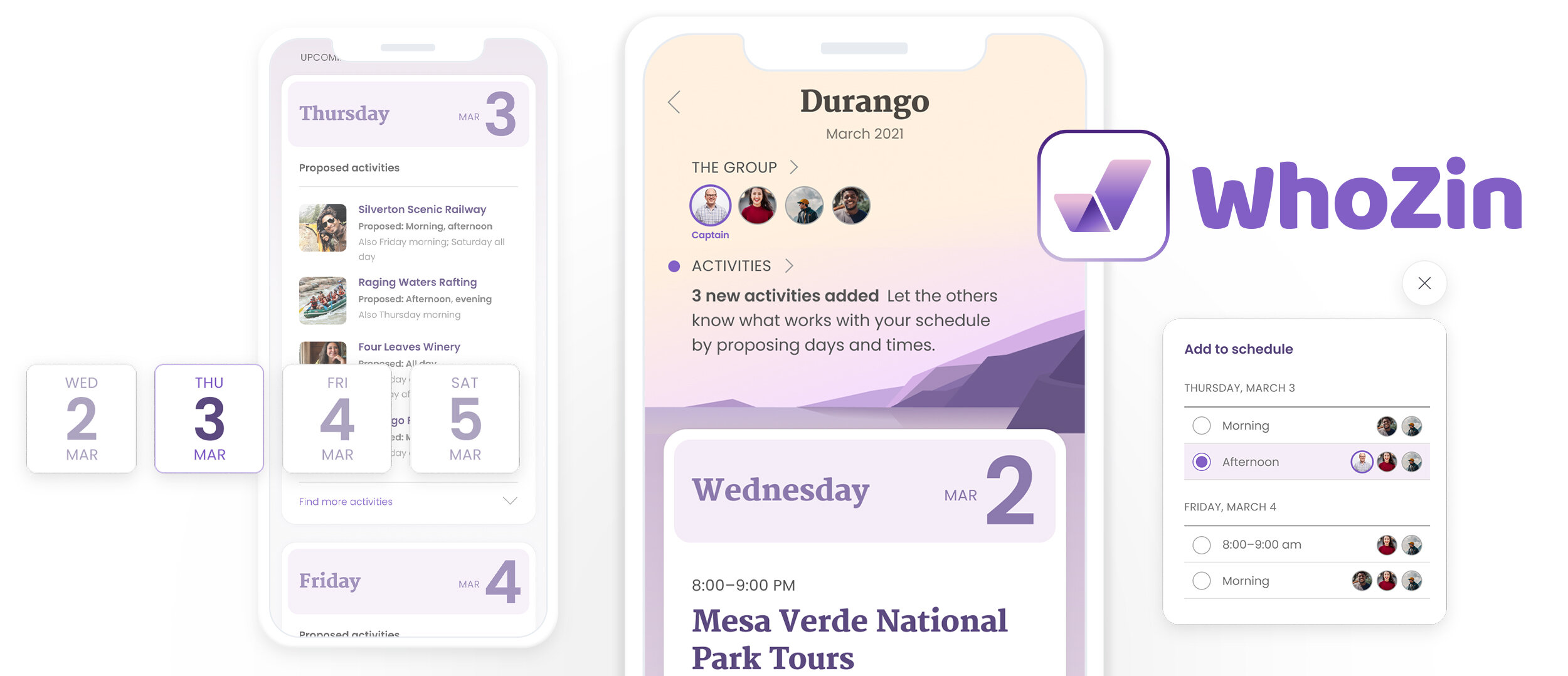
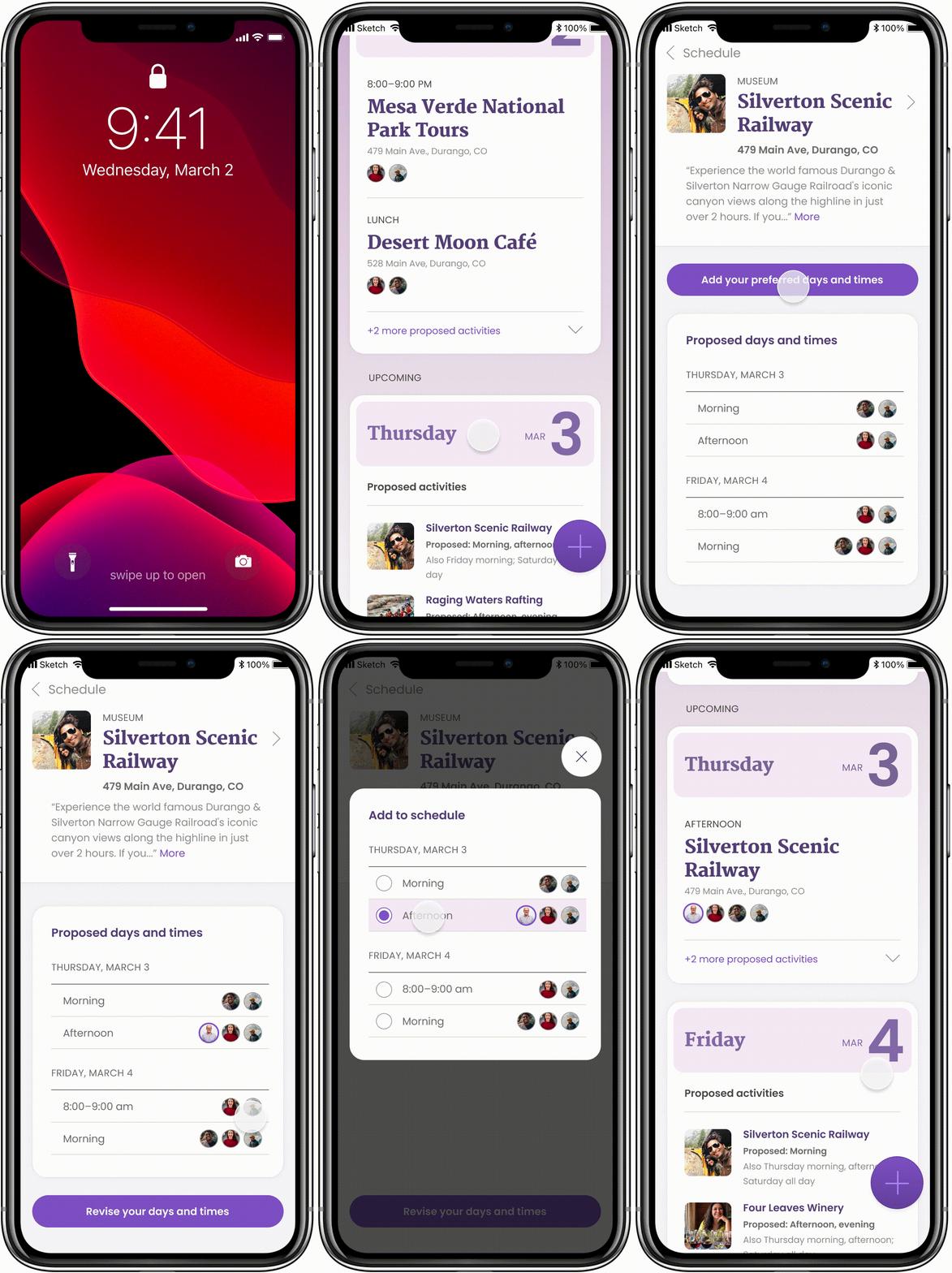
Two flows were devised, one following the other. In the first, the user views an activity proposed by fellow travelers, and — using the opt out feature — modifies their availability to indicate specific times they’re available for it. In the second flow, the organizer of the trip would add the activity to the final schedule based on group consensus.
⚠️ Eateries would later be eliminated as a separate category, so all activities could be suggested in a single process.
Phase 3:
Design
With research completed and the problem framed, solutions to encouraging collaborative trip planninf were explored. Ideas were generated and then iterated upon to eliminate friction wherever possible.
Rapid Ideation, Storyboarding, and Wireframes
Concepts were developed using the “crazy 8s” method of rapid, high-volume ideation. A set of storyboards were distilled from ideas generated from “crazy 8” concepts. Wireframes were created to reflect revised storyboards. Research indicated it would be important to include features to easily:
Access the schedule at-a-glance
Add proposed activities.
Indicate proposed dates and times.
Move activities into and out of the final schedule.
Delay processing new activities via an inbox.
Minimize scrolling from day to day.
Send notifications to participants nudging them to indicate preferences.
Clearly identify group members and their choices or non-participation.
Step 1: Rapid Ideation
Step 2: Storyboarding
Step 3: Wireframes
Mid-Fidelity Prototype Testing
With wireframes completed and a firm handle on the user flow, Figma was used to thread the wireframes together into a mid-fidelity prototype for user testing.
Key Findings
It was unclear to testers when adding a proposed activity that the default setting pre-selected all dates and times, which then required de-selection in order to indicate one’s specific time preference.
When adding an activity to the final schedule, it was unclear that a static list of activities was now a selectable list.
Continuity for phraseology needed refinement, for example: add an activity; add proposed times; add to schedule.
Seeing others travelers’ date and time preferences helped users determine whether other’s choices were also good for them.
The “add” floating action button’s function was unclear. Was it there to add an extra day to the trip or to add a proposed time?
It wasn’t clear that the sliding date selector contained more than three days.
High-Fidelity Mockups
Wireframes were brought to life in Figma with the addition of color, illustrations, and refined type choices. A UI kit was also compiled:
Click to enlarge
Phase 4:
User Testing
The high-fidelity mockups were linked together to create a functioning prototype and the newly-refined user flows were usability-tested. Adjustments were made based on user feedback.
High-Fidelity Prototype Testing
Participants were asked via video conference to navigate the prototype with the following tasks: First, propose taking the Silverton Scenic Railway on Thursday afternoon. Second, as the organizer (or “Captain”) of the trip, add the activity to the confirmed group schedule. Testers shared their screen during the test and talked through their thought process while completing the tasks. After finishing, participants retraced their steps, providing additional thoughts, observations, or positive and negative feelings about the task.
Key Findings
Users were still unsure about the function of the “add” floating action button.
Possibly grey out activities to indicate they have been “final” scheduled on another day.
Users thought “available” times indicated hours of operation. “Available” applied to the times people proposed.
Need for better contrast on sliding date selector tiles; possibly an arrow to imply slider.
Users split whether it was presumptuous and/or practical to presume users would be open to any activity any day by default.
The change from a list of proposed times to a select list of radio buttons wasn’t completely obvious.
“Select a proposed time” should imply a move away from proposing toward scheduling—like “Schedule this activity.”
After confirming/adding an activity to the schedule, testers were not confused by the subsequent visible changes to the calendar—a spotlighted activity; hidden alternates. (Tester quote: “This is the schedule, this is what’s happening. And these smaller ones are just proposed activities.”) Still, it was suggested a word, symbol, or color change might clarify by offering a visual clue that something has been scheduled.
It might be good to remind the user on the main screen that they’re the organizer, or “Captain.”
Conclusion:
Reflection
“Solve a problem.” The possibilities were dauntingly broad for this project. While my first instinct was to tackle a Covid-related intangible—interviewing people about their perception of time during lockdown—few actionable findings came out of it. Travel, though, felt like a luxury. A return to normalcy was inspiring: Travel! With friends! A group of them!
The thing that struck me in my research was that, in trying to create enjoyable experiences, people who take the planning role for a group trip are putting their relationships on the line. If planning could be more collaborative, maybe the decisions the planner makes could be better-informed and misunderstandings and hurt feelings could be averted.
It occurs to me that with some refinements this project could broaden in scope to help groups of people gain consensus in other situations. That would be a problem worth solving.


