Case Study: Fitzgerald
A Fresh Coat
A global fast-fashion retailer goes all-in on e-commerce
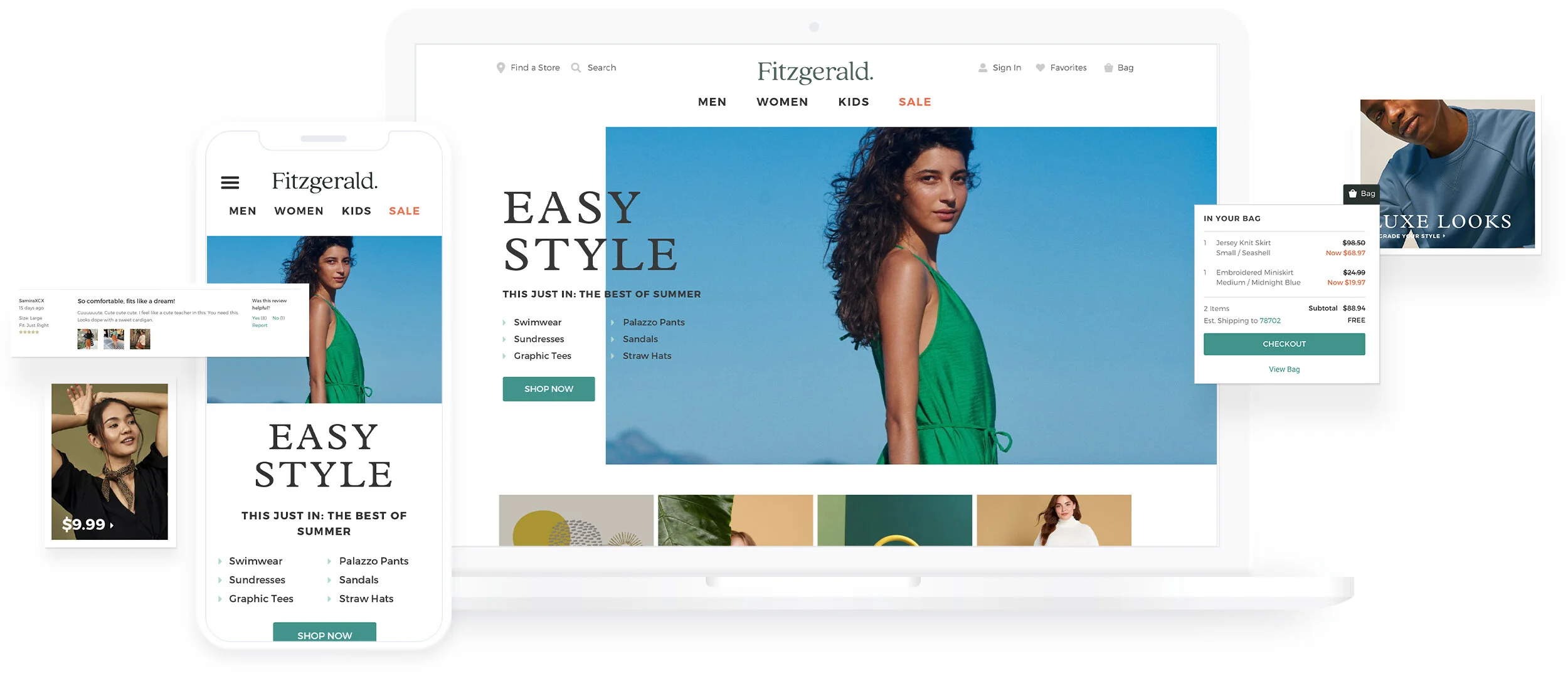
While customer surveys consistently show high demand for an expanded e-commerce experience, Mirror has until now maintained only a bare-bones online presence. With the launch of a full-featured direct-to-consumer experience and a name change — to Fitzgerald — Mirror is planning for improved customer engagement and increased sales.

Kevin Bhagat/Unsplash
The User
Fitzgerald’s audience is broad—their customers span all age brackets, races, ethnicities, and genders.
The Goal
Identify pain points and unmet needs of customers who shop for clothing online.
Methods and Roles Employed
Primary and Secondary Research, Information Architecture, Branding, UX Design, UI Design, Prototyping, and Usability Testing
Phase 1:
Research
To gain insight into the needs of its users and competitive space, Fitzgerald deployed market research, competitive analysis, and user interviews to identify opportunities to improve the online shopping experience.
Market Research
Sales at traditional brick-and-mortar department stores were in free fall due to the coronavirus shutdown. As one expert told the The New York Times, “few are likely to survive.”
Online retail sales, accordingly, are a necessary component in order to survive this new economic landscape.
Fashion that was quickly designed and produced, then sold at low price points, held a large percentage of the global fashion market, eclipsing many established retailers.
Even in pre-pandemic and economically stable times, retail profits margins are thin, so sales volume is key to success.
Capturing and holding consumers’ interest is challenging when competitors are numerous and facing similarly thin profit margins.
Even before recent economic events, the industry has been shedding competitors. Forever 21 filed for bankruptcy, and H&M revealed consistent cycles of large quantities of unsold merchandise.
Competitive Analysis
Click to enlarge

Erik McLean/Unsplash
User Interviews
One-to-one interviews were conducted with customers of Fitzgerald competitors. During roughly 30-minute interviews performed over the course of 3 days, users were asked for a step-by-step account of an online clothing purchase made within the last 10 days.
Five interviews were conducted: two females in their mid-20s, one female (and mother) in her mid-40s, one mid-50s male, and one mid-70s female.
Needs and Goals
Wants to know before going to the store whether their size is in stock.
Wants to see models in their age group wearing the clothes purchased online.
Wants ways to make decision-making easier.
Wants to be delighted by serendipitous finds.
Wants favorite items that can be purchased in different colors.
Wants to find a retailer that “gets” them—their size, style, favorites.
Pain Points
Users fear:
Quality will be lower than expected.
Spending too much money in an unstable economy.
Too many choices make them frustrated and overwhelmed.
Key Insights
Users want:
More inclusive model selections.
Emphasis on low prices, in particular at times when they’re uncomfortable spending freely.
Enhanced filter options to facilitate faster searching.
Emphasis on quality compared to that of other online retail competitors.
Proof that Fitzgerald “gets” their customers.
Emphasis on a desire to rebuy favorite items.
Information on whether their size is in stock.
Technology to approximate what they’ll look like in the clothes before buying.
Ways to make decision-making easier.
The excitement and satisfaction of serendipitous finds.
A retailer from whom they’ll rebuy favorite items in different colors.
Bargains, but not at the expense of quality.
Phase 2:
Define
Results from the Research phase indicated the need for ways to meet both the user’s needs and the business’ goals with an online product. From this, a problem statement was crafted and user flows and information architecture were employed to identify solutions.
Persona
A single persona was synthesized from user research to represent the Fitzgerald customer. Alex Rhodes is a 24-year old female and young professional—a Marketing Associate from Austin, Texas. While she has purchasing power, it is limited because she recently moved out of her parents’ home to live with peers. She values her friends’ opinions when it comes to style, and they often alert each other to sales.
Click to enlarge
Empathy Map
The empathy map—a distillation of the single customer persona’s needs and goals—revealed Alex’s desire to find a retailer that “gets” her. She wants clothing that is inexpensive, but not look it. And Alex’s online purchasing is influenced by the speed and cost of shipping. This deep understanding of her needs and motivations would later inform Fitzgerald rebranding and site features, like the prominent placement of sale prices. The empathy map also influenced the priorities, like in-store pickup and user reviews and photos, of the feature roadmap.
Click to enlarge
Click to enlarge
Project Goals
Insights from user research was compared with the original project brief, revealing where business goals and user goals overlap—and where they don’t. Both business and users want a high level of brand loyalty, a speedy check-out process, and regular communications about sales.
Click to enlarge
Feature Roadmap
A feature roadmap was created according to a better understanding of users’ expectations when shopping for clothing online. This chart prioritized Fitzgerald’s potential product features based on how crucial they were deemed, feasibility of development, return on investment, and ability to satisfy user goals. The roadmap showed how a balance of filtering features were necessary to keep clothing selection and purchasing interactions speedy.
Card Sorting
Card sorting exercises helped align Fitzgerald’s product categories to users’ expectations. Six participants (one male and five females; ages 24 to 55) sorted 30 products into categories. Participants created 28 categories in total, an average of 4.6 categories per participant.
Participants created a surprising number of inspired and creative categories beyond tops, bottoms, and accessories.
One participant created categories around their personal style guidelines, rather than popular tastes.
Some categories read like warnings—Wear These Wisely, and No One Should Really Wear
Some categories were lifestyle-based, such as Preppy Mom, Colorado Casual
Some categories indicated clothing by Type of Event, or Complete Outfit, or Classics
While there was little agreement over how to categorize products, the exercise showed there was a desire for curated categories. In short, individual items that “live” in different places on the sitemap, are more attractive when displayed as a collection alongside complementary products.
Click to enlarge
Site Map
Creation of the site map was guided equally by the results of card sorting exercises, the competitor analysis, and the needs assigned to Alex. Products were primarily sorted into Men’s, Women’s, and Kids’. And a section for editorial stories was included to fulfill users’ need for curated collections.
Women’s pants, shorts, and skirts were presented grouped under Bottoms. Multiple testers would remark that they expected those items would merit their own separate categories.
Click to enlarge
Task Flow
A task flow for successfully purchasing a skirt was developed, mapping out the necessary steps and reducing the task to its essential actions, regardless whether the shopper is in-store or online.
Click to enlarge
User Flow
In preparation for user testing, a user flow was created from the task flow to describe the “happy path” a customer might take on their way to check-out.
Click to enlarge
Phase 3:
Design
Rebranding is an opportunity to alter customer perceptions. Companies who sell reasonably-priced clothing generally suffer from the perception that their affordable products are equally low in quality. Mirror's brand reinvention was an explicit course correction to that notion.
Rebranding
The name Fitzgerald was selected for its associations with President John Fitzgerald Kennedy, the most notable member of an American dynasty, and then F. Scott Fitzgerald, a lion of American literature. The Fitzgerald brand initially reflected classicism and refinement. The brand identity reflects on the freedom found in early twentieth-century New York literary circles.
Click to enlarge
Wireframes
Wireframes were developed for key pages of the User Flow, combining insights from research with a list of required UI elements. First, pages were sketched quickly to design the basic structure. Then pages were fleshed out into more-detailed medium-fidelity wireframes. A mobile version of the homepage layout was also wireframed.
The wireframes reflect user needs like easily-spotted sale pricing and user-submitted product photos, reviews, and ratings. Additionally, “Sale” was made a top-level nav item, the number of items per page was limited, a sign-up form was added for deal alerts, products with multiple colorways were grouped as a single product, and price-reduction promotions were given prominent placement.
Click to enlarge
Brand Style Guide & UI Kit
The Fitzgerald brand reinterprets traditional elements associated with legacies of American literature through a lens of modern simplicity. Various combinations of color, type, and imagery were explored.
This brand style was applied to the building blocks of web interaction—headings, buttons, form elements, the nav bar, and other design patterns—in order to preview how it might play out in use.
Click to enlarge
Click to enlarge
High-Fidelity Screen Mockups
Wireframes were brought to life by employing the color, photography and type styling laid down in the Brand Style Guide. A mobile version of the homepage was created to ensure layouts would gracefully reorganize for smaller screens.
Click to enlarge
Phase 4:
User Testing
To test the “happy path” laid out in the User Flow, page mockups were arranged in sequence with a limited number of possible interactions. The resulting prototype was tested with users and less-optimal interactions were revisited until the path was smooth and free of complications.
Click to enlarge
Prototype
In video conference calls participants were asked to navigate the prototype with the goal of locating and purchasing the Embroidered Miniskirt, size medium. Participants shared their screen and talked through their thinking as they completed the task. After finishing the task, each participant retraced their steps and gave additional thoughts and insights about positive and negative feelings, motivations and concerns.
Key Findings
“Bottoms” is not a commonly used category name. Users felt the category should be broken into separate Jeans, Pants, Shorts, Skirts, etc. categories.
25% of participants attempted to locate the product using Search.
Category lists should lead with frequently-purchased items first, like Dresses, Pants, Tops, etc., followed by secondary products like Sleepwear, Outerwear, Shoes, Accessories, etc.
Users found it unclear that “Women” was clickable in the nav. That said, the ambiguity generally led users to skip directly to one of the categories in the dropdown menu.
Filtering options could be further refined by, for example, adding Clearance.
Users found that the discoverability of User Reviews and User-Submitted Photos needed work.
More information about the reviewer was requested so users could determine whether the reviewers share their size, build, lifestyle, etc.
Conclusion:
Reflection
Upon reflection this project was an excellent exercise translating a user’s needs into practical, functional design. I expected to find that there were limited ways to organize an online store, but research and testing revealed that it is possible to organize according to users’ specific needs. Employing familiar, intuitive user patterns proved indispensible in easing a customer’s journey toward checkout.