Case Study: Tyke Pediatrics
New Arrival
Helping new parents book their pediatrician appointments

Larry Crayton/Unsplash
The Users
Mothers, fathers and guardians of children, from infancy through pre-teen age.
The Goal
Identify the unmet needs of users who would like to book pediatrician appointments online.
Methods and Roles Employed
Primary and Secondary Research, Information Architecture, Branding, UX Design, UI Design, Prototyping, and Usability Testing
Phase 1:
Research
Market research, competitive analysis, and user interviews were employed to gain insight into pediatricians’ customers needs and the industry that currently serves them. The aim was to identify opportunities to improve the appointment booking experience.
Market Research
Users who take the time to book on the phone may discover they have weeks to wait.
Patients dislike waits of uncertain duration and that are not explained to them. They perceive waiting as unfair.
Booking an appointment takes an average of 8 minutes on the phone vs. 1 minute online.
Millennials and younger don’t even want to pick up the phone.
Patients who book online see their wait times decrease and providers see their efficiency and patient satisfaction rise.
Online scheduling can be a differentiator that allows practices to capture more patients and improve operational efficiency.
A 2017 study revealed 80% of patients prefer physicians (primary care and specialists) who offer online scheduling.
Patients who most prefer online scheduling will book more appointments. They also tend to be younger, more affluent, and higher-educated.
Online scheduling makes physicians more competitive. Consumers choose to see providers who are farther away but have online scheduling by 2-to-1 margin.
By a 4-to-1 margin, when choosing a specialist, consumers prefer a physician who has online scheduling, even if they have less availability.
When paired with text and email reminders, online scheduling can help reduce no-shows by as much as 25%.
HIPPA rules apply to data transfers.
New services integrate into existing practice management systems to fill vacant schedule slots using AI-based waitlist management. They suggest new appointments after a cancelation and shift patients to other physicians to balance load.
Competitive Analysis
Click to enlarge
User Interviews
One-to-one user interviews were conducted over the course of 3 days with five parents of infants and toddlers. During roughly 30-minute interviews, users were asked to give a step-by-step account of the last time they booked a pediatrician appointment.
Three females in their early-30s, two males in their mid-30s, one female in her late 20s were interviewed. Among those participants were two husband-and-wife couples, in hopes that their separate experiences could be compared.
Needs and Goals
Want to be able to create a list of questions to discuss with the doctor to help quell uncertainty.
Tries to get the same time slot (first of the day) for each appointment. But won’t delay more than a week or two for it.
Everything else they book or buy, they do it online. Would love to just select a time, like they can at their salon.
Vaccine appointments are stressful and the child can develop a fever, so would like to be warned if they’ll be administered at a given appointment. Both parents might need to attend, or one might need to take the whole day off.
Some continue going to a doctor they don’t love simply because the availability is good.
Would like to receive calendar invites and other reminders.
Would like to fill out forms ahead of time—and then only if something’s changed.
Would like a written care strategy to help remind them of the purpose of upcoming appointments. It’s a feature their adult doctor provides.
Pain Points
Rescheduling appointments requires a phone call.
Both parents would like to be in attendance, but their doctor currently only allows one parent at a time.
Their doctor’s practice has a portal from the dark ages, you can’t upload pics or videos.
Dislike having to tell the assistant, the nurse, and then the doctor all the same info.
Would like to see a list of virtual visits when available.
If they don’t add appointments to their calendar immediately, they forget and have conflicts later.
Key Insights
When their baby was in daycare, they were going to the doctor once a month.
With good wifi in the office they’ve found they can do FaceTime and both be there.
Because of COVID, anything other than well-child appointments are generally done via videoconference.
Would change doctors if they needed to—because of reduced availability or a mismatch of philosophy, for instance.
Phase 2:
Define
After the research phase was complete, we synthesized the findings into actionable data. Then we created a user flow to test, laying the groundwork for the designs to come.
Persona
From the user research a single persona was created to represent the user.
Amanda Cook is a 35 year-old first-time mother—a research scientist from Austin, Texas. She’s used to doing everything online—buying groceries, getting a dinner reservation, managing the household, and even tracking her baby’s health. Her husband is equally involved in their baby’s development and goes to the pediatrician with her so they’re making decisions together.
Click to enlarge
Empathy Map
The empathy map—a distillation of the goals and needs of customers like Amanda—highlighted her need for convenience and flexibility in booking appointments. She is highly influenced by the ease of conducting a transaction and has made decisions about healthcare providers based on it. She would like to have a way to remind herself of appointments, what’s scheduled to happen during the visit, and secondary issues she’d like to discuss while she’s there.
This understanding of her motivations would later inform site features such as SMS reminders and calendar appointments, simplified vaccination schedules and a selectable list of topics she might discuss with the doctor.
Click to enlarge
Data Clarification
Further research was performed via survey to gain clarity on some features. Topics we were looking to clarify were:
The language parents would expect to find on the buttons that initiate the booking process.
The average duration of past appointments.
The shortest and the longest appointments they have had and the purpose of them.
Click to enlarge
User Flow
The path determined to be best for testing involved three tasks: booking an appointment, including account creation, and selecting in advance additional topics to discuss with the doctor.
A few changes were made after the first round of user testing:
Appointment Type
Initially, appointment duration could be adjusted based on user input (Additional Appointment Info). However, due to the variables at play—and a recognition that the gains achieved might be relatively minor—appointment duration was moved to the future feature roadmap. Research and testing with doctors would be required to determine its utility.
Account Creation
The account creation process was adjusted after user testing. Originally, account creation and adding children to the account were performed in the same step. This format made account creation unnecessarily complicated. The process to add/select a child, eventually, was moved into a revised Appointment Info step.
Log In
After selecting an appointment during user testing, some users were irked at then being asked to log in. They liked this arrangement because it allowed them to survey the doctor’s availability without signing up or logging in. Others preferred logging in before selecting an appointment.
Phase 3:
Design
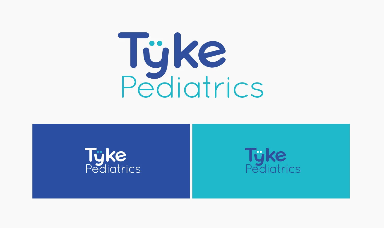
The name Tyke Pediatrics was chosen for its lighthearted quality and the sense of modernity that comes with a branded practice. It's clear that neither the technology nor the philosophy of this practice will be behind the times.
Branding
The branding for Tyke embodies a youthful sense of play, but reflected in precise, modern forms. The soft rounded features of Quicksand Bold imply safety and the geometric qualities imply reliability. Letterforms were modified to exaggerate the x-height, a pair of eyes were added to the modified y to create a smile, and the already-laughing lower case e was tilted back in a LOL.
Low-Fidelity Sketches & Mid-Fidelity Wireframes
Several key experiences were sketched to allow for rapid iteration. The booking page was originally conceived with a monthly calendar display, but a simpler solution was found in selecting the month from a dropdown menu, then using side-scrolling to select a day.
Click to enlarge
Mid-Fidelity Prototype Testing
With wireframes completed and a solid user flow, the wireframes were threaded together in InVision and user tested.
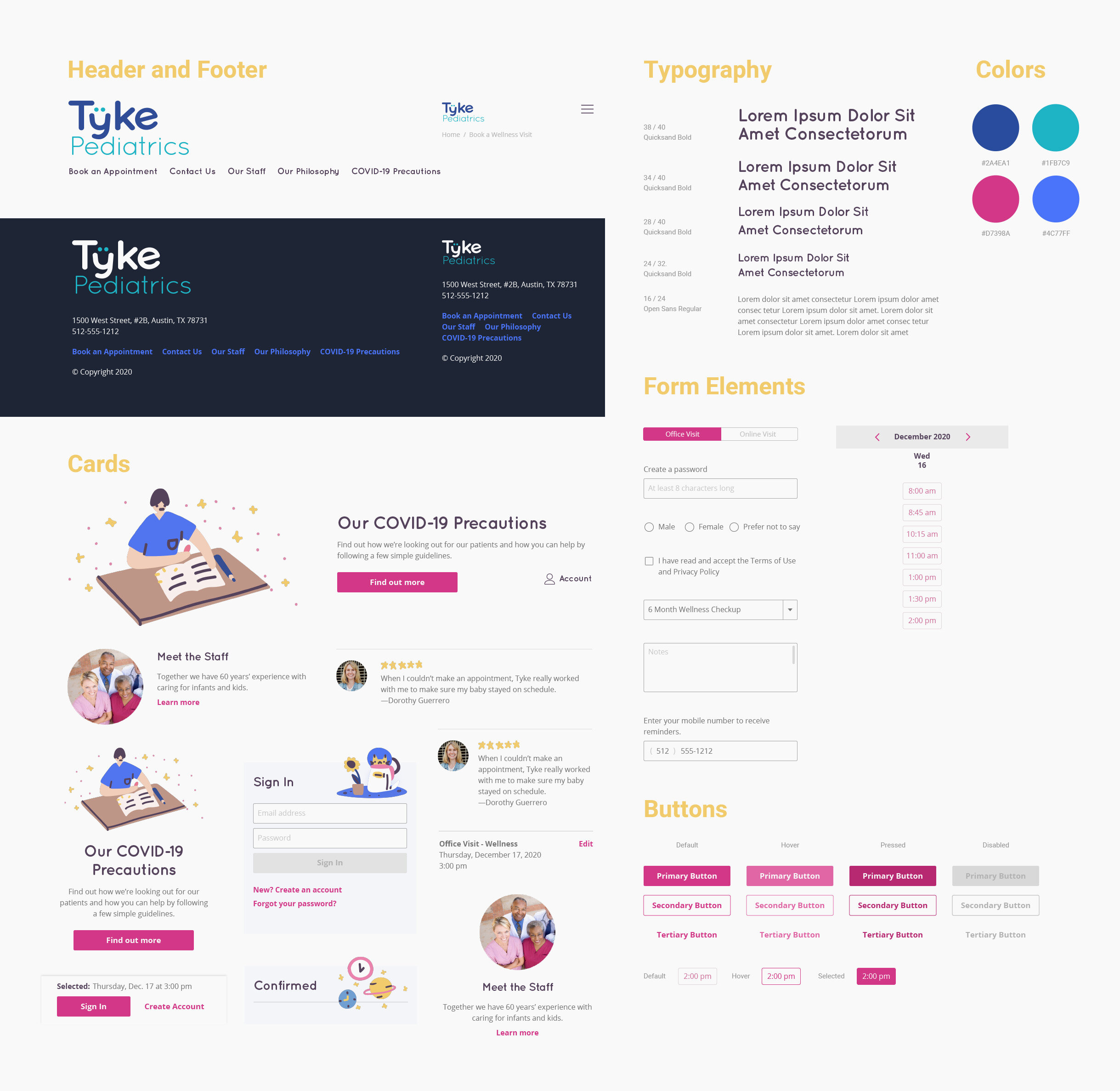
Brand Style Guide & UI Kit
To improve brand cohesiveness, the typeface used for the logo was selected for the display font. Open Sans was selected to be a simple, unobtrusive complementary body font. The the blues and teals of the color palette, are colors often associated with the healthcare industry. An accent color was added for punch and call-to-action visibility.
The illustrations broaden the color palette by introducing a yellow. They’re playful in a way that will remain appropriate through all stages of a young patient’s development without ever feeling too “baby.”
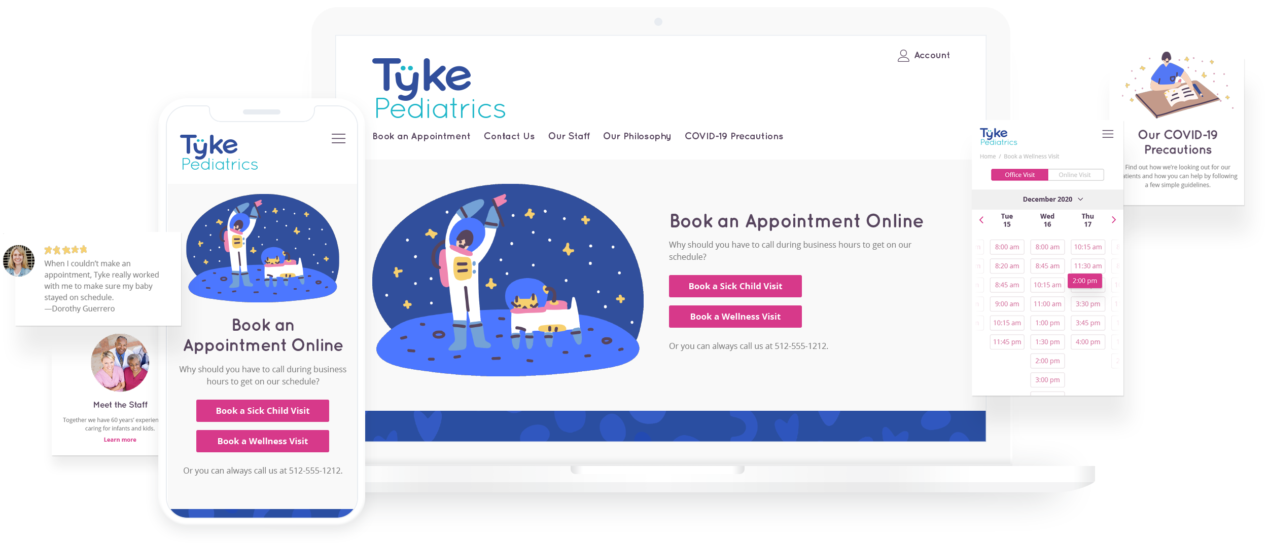
High-Fidelity Mockups
Wireframes were brought to life with color, illustrations, and the application of the typography from the Brand Style Guide. A desktop version of the homepage was created to demonstrate how layouts would reorganize for larger screens.
Click to enlarge
Phase 4:
User Testing
Using InVision as a prototyping tool, the mockups were linked together with a limited number of possible interactions. The “happy path” laid out in the User Flow was tested and adjustments were later made based on user feedback.
High-Fidelity Prototype Testing
Participants were asked via videoconference to navigate the prototype to book a wellness appointment for their daughter on December 17 at 3:00 pm. Participants shared their screen and talked through their thought process as they completed the task. After finishing, each participant retraced their steps and provided any additional thoughts, observations, or positive or negative feelings.
Key Findings
Users were confused by the Reasons for Visit page. To improve the interaction, the options were consolidated into a simple dropdown with predetermined options (Scheduled Visits), and “Other…” which revealed a text field.
If a user selects a Scheduled Visit, the detail page displays the list of vaccines the parent can expect to be administered during the visit.
Several navigation elements of the Book an Appointment page were unclear. Using feedback, the month became a dropdown and arrows were added to the days of the month so users could more easily page forward and backward three days at a time.
On the Account Creation page, the fields for account creation were consistently mistaken for a login box. The design was adjusted to clarify.
Enabled the addition of more guardians to the account.
Click to enlarge
Conclusion:
Reflection
This project was an opportunity to investigate an unfamiliar industry and create a service with users’ specific needs in mind. Several users I spoke with said they wished their doctor had this kind of online appointment booking. I expected to ask users what minimum data they felt was necessary to book the appointment. I, however, uncovered a desire to communicate concerns to the doctor ahead of time, providing as much info as possible. The copious form elements needed were initially overwhelming, but rearranging them into multiple screens resolved that issue and supported users in planning interactions with their pediatrician.